Freelancer: ephdesign13
Jaa:
Tee ilmoitus työstä

here's the revision

Here's the revision Sir, Please check the design and let me know if you need another change, Thanks!
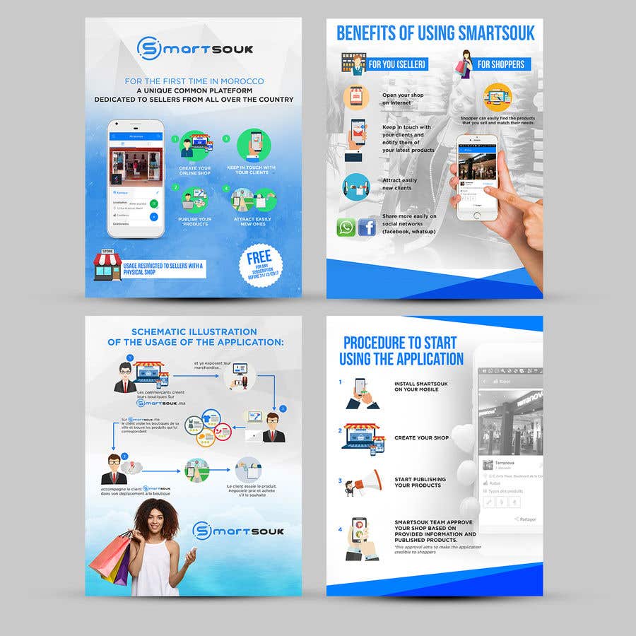
Kilpailutyö #30 kilpailussa                                                 Design Brochure for sales mobile application

Julkinen selvennystaulu

  • relalaoui
    Kilpailun järjestäjä
    • 6 vuotta sitten

    too white here

    • 6 vuotta sitten
  • relalaoui
    Kilpailun järjestäjä
    • 6 vuotta sitten

    Put the women in the background

    • 6 vuotta sitten
  • relalaoui
    Kilpailun järjestäjä
    • 6 vuotta sitten

    User rounded corners

    • 6 vuotta sitten
  • relalaoui
    Kilpailun järjestäjä
    • 6 vuotta sitten

    Images in this page needs to be more homogeneous in terms of colors, forms and sizes.

    The same thing for text, can you align it please

    • 6 vuotta sitten
  • relalaoui
    Kilpailun järjestäjä
    • 6 vuotta sitten

    Replace with an illustration of seller taking photos of his products.

    • 6 vuotta sitten
  • relalaoui
    Kilpailun järjestäjä
    • 6 vuotta sitten

    Here use the screenshot listing the products

    • 6 vuotta sitten
  • relalaoui
    Kilpailun järjestäjä
    • 6 vuotta sitten

    The title is too big, and there is not enough space in this page.

    • 6 vuotta sitten
  • relalaoui
    Kilpailun järjestäjä
    • 6 vuotta sitten

    The shopper should not be the same person as the shopper.
    step 1 : seller
    step 2 and 3 : shopper
    I suggest you put a man or women looking at a phone or computer. why not the same as before.

    • 6 vuotta sitten
  • relalaoui
    Kilpailun järjestäjä
    • 6 vuotta sitten

    A man with a tie does not really represent a a seller in a Moroccan shop.

    • 6 vuotta sitten
  • relalaoui
    Kilpailun järjestäjä
    • 6 vuotta sitten

    I don't like it. I suggest you replace with white text directly on the blue background. Try and see the result.

    • 6 vuotta sitten
  • relalaoui
    Kilpailun järjestäjä
    • 6 vuotta sitten

    After some consideration, i think there's no need to distinguish benefits for seller and shoppers. You can merge them.
    This could help you reorganize this page to look simpler and easier to read

    • 6 vuotta sitten
  • relalaoui
    Kilpailun järjestäjä
    • 6 vuotta sitten

    I don't like the green color here

    • 6 vuotta sitten

Näytä lisää kommentteja Käsitellään...