Provider One Logo

  • Tila: Closed
  • Palkinto: $50
  • Vastaanotetut työt: 55
  • Voittaja: Jdparmar09

Kilpailun tehtävänanto

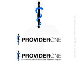
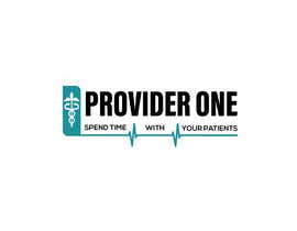
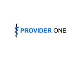
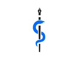
We are a medical scribe company looking to create a higher-quality logo. Right now we have the design that we want, which is the emergency medicine snake and staff, but with the staff designed to look like a fountain pen (please see the attached photos). We love the design and want it to remain the same, but we need a higher-quality version made that has more pixels and can be made larger without compromising the quality.

REQUIREMENTS:
- Logo MUST include the Emergency Medicine snake and staff
- Staff must be made to look like a fountain pen

**UPDATE:
If possible, please submit three logos:
- One with just the image of the snake and pen
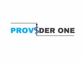
- One with the image of the snake and pen, plus the company name Provider One
- One that includes the image, our name Provider One, and underneath Provider One the tagline: "Spend Time with Your Patients, Not the Computer"

Thank you!!

Suositellut taidot

Työnantajan palaute

“Jaydeep is an absolute pleasure to work with. He is responsive, timely, and produces very high quality work. He designed our company logo and did an incredible job. I would recommend to anyone looking for design work. Thank you Jaydeep!”

Profiilikuva ProviderOneInc, United States.

Kilpailun parhaat työt

Näytä lisää töitä

Julkinen selvennystaulu

  • OneSevenPoint5
    OneSevenPoint5
    • 4 vuotta sitten

    Here's the modification of my entry 22 - #25

    • 4 vuotta sitten
  • OneSevenPoint5
    OneSevenPoint5
    • 4 vuotta sitten

    Please check my entry #22 . It's exact copy of your design, with natural looking 'pen nib + snake head' design. The colors in the entry may look different due to freelancer.com image compression for entry submissions, but they are exactly the same as per the attachment files you have given. Thank You!

    • 4 vuotta sitten
    1. OneSevenPoint5
      OneSevenPoint5
      • 4 vuotta sitten

      Also, the tolerances are taken in consideration so that if you want to print the logo design, the edges won't overlap on each other. Take a look at the spacing between the middle blank part in the pen nib, you will get the idea if you are unfamiliar with this. Thank You!

      • 4 vuotta sitten
  • ralokofficial
    ralokofficial
    • 4 vuotta sitten

    #20 feedback please

    • 4 vuotta sitten
  • arifulislam001
    arifulislam001
    • 4 vuotta sitten

    #guaranteed Please

    • 4 vuotta sitten
  • Imran4595
    Imran4595
    • 4 vuotta sitten

    #guaranteed

    • 4 vuotta sitten

Näytä lisää kommentteja

Kuinka päästä alkuun kilpailuiden kanssa

  • Ilmoita kilpailusi

    Ilmoita kilpailusi Nopeaa ja helppoa

  • Saat valtavasti töitä

    Vastaanota tonnikaupalla osallistumisia Ympäri maailmaa

  • Myönnä palkinto parhaalle työlle

    Myönnä palkinto parhaalle työlle Lataa tiedostot - Helppoa!

Ilmoita kilpailu nyt tai liity tänään!