Design A Website Front Page
- Tila: Closed
- Palkinto: $250
- Vastaanotetut työt: 20
- Voittaja: kreativeminds

Kilpailun tehtävänanto
Hi, Please view attached mockup by me. I'm a immature without knowledge of design. The function I've is important but how you approach it may be completely different because of your experience and expertise. You don't have to approach it as how I approach it.
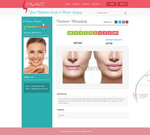
I need a home page of my website and logo for FIXorNOT.com ... The website allow people who plan on having cosmetic/plastic surgery to share their photos to get other people opinions if they should fix or not ( 1 is not and 10 is fix).
Function:
1. Previous Results
2. Main Fix or Not rating images
3. Additional rating images
4. Simulator images And additional simulator images
5. Title of procedure
6. Member description of the procedure
7. Fix or Not rating scale
9. Share This button
10. Comment box
11. Comment display
Please read this: VERY IMPORTANT: please check the color.jpg for the color of the theme, red, green, blue. Use this color palette.
90% of the user of FIX or NOT are female, However I don't want the site to look to feminine or only for female. I would like 60% female and 40% male. ! Target age: 18-35 years old. Young and Energetic.
Very Important: The design focus on " Clean, Simplicity and Elegant". The Key is to Focus on the services of the FIX or NOT rating. Its need to be clean and look nice and simple, yet easy to look at.
The rating scale is base on the level of importance from 1 (not) and 10 (fix). I would like it to be in number from Left starting with (10 FIX) 9 8 7 6 5 4 3 2 (1 NOT)
Level of importance: Not at all important (1,2), slightly important (3,4), important (5,6), fairly important (7,8), very important.(9, 10)
I was thinking maybe the 1 can be "NOT" and the 10 can be "FIX".
I was thinking maybe the rating scale can be color coded: Green is FIX to a Red shade. The color coded rating scale may not look very attractive, don't use it if doesn't look attractive.. (Please view attached scale I found on google but remember if it doesn't look good, come up with a different way)
The red color I was thinking about is the red color found on this site header menu: http://www.babble.com/
Also, the "previous result" has a bar result. The bar will display the result base on the color coded. So for example if a person has a result of 3.4 .. it will say 3.4 and has the color code progress bar up to that color. At the bottom it shows the level of importance "Slightly Important".
The main images:
The main images may contain only 1 images (before) only for those without a treatment simulator photo. For those with a photo simulator images. It will display before and after treatment simulator images. User can have multiple images for before and after but I don't know how best to represent this. The only way I came up was to make an error to slide if there is more photo but your welcome to come up with any new solution to addressing the additional image problem.
THE WINNER WILL BE SELECTED TO COMPLETE THE FULL TEMPLATE FOR $300 if you want!
Suositellut taidot
Työnantajan palaute
“excellent work!”
![]() foodstamps, United States.
foodstamps, United States.
Julkinen selvennystaulu
Kuinka päästä alkuun kilpailuiden kanssa
-

Ilmoita kilpailusi Nopeaa ja helppoa
-

Vastaanota tonnikaupalla osallistumisia Ympäri maailmaa
-

Myönnä palkinto parhaalle työlle Lataa tiedostot - Helppoa!