Design a Logo for Little Learning Cloud
- Tila: Closed
- Palkinto: $50
- Vastaanotetut työt: 116
- Voittaja: himel302

Kilpailun tehtävänanto
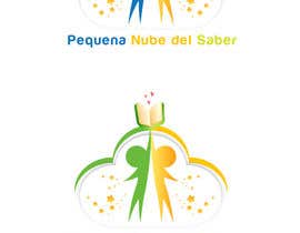
Little Learning Cloud (Pequena Nube del Saber) will be a website intended to provide resources for teachers and parents of spanish speaking children in the age of pre-school and lower grade levels,
We want a PICTORIAL logo that is simple and versatile, Creative and fresh, preferable asymmetric, in curved shapes. we want it to be clear and easy to identify when in very small printing or water mark. Colorful for the website and good looking in gray scale mainly because all the material will be reproducible
Futuristic if possible and not to serious.
Colors preference it will be desirable to have tones similar to cyan, but we are open to ideas.
Logo should work in both, English and Spanish.
Suositellut taidot
Työnantajan palaute
“Excelent results.”
![]() camoatech, United States.
camoatech, United States.
Julkinen selvennystaulu
-

tenstardesign
- 10 vuotta sitten
Hi i think.. #143 looks better. In top four CH
- 10 vuotta sitten
-

Kilpailun järjestäjä - 10 vuotta sitten
We apologize for our ignorance. We were assured it was an original idea, and based on this word we chose the logo. Thanks for letting us know. We will choose a new winner.
- 10 vuotta sitten
-

babu0211
- 10 vuotta sitten
http://www.48hourslogo.com/48hourslogo_data/logo/201207/201207081744055112.jpg
- 10 vuotta sitten
-
babu0211
- 10 vuotta sitten
please copied @ ayudevelopers http://www.48hourslogo.com/project.php?id=12513
- 10 vuotta sitten
-

Don67
- 10 vuotta sitten
please check thanks
- 10 vuotta sitten
-
tenstardesign
- 10 vuotta sitten
Please check
- 10 vuotta sitten
-

marchitetto85
- 10 vuotta sitten
- 10 vuotta sitten
-

sudeepvallathol
- 10 vuotta sitten
LOGOs with the required ideas in 'Vector format' are submitted ( #173 -2 entries). Please check it and comment.
Regards- 10 vuotta sitten
-
tenstardesign
- 10 vuotta sitten
Please rate
- 10 vuotta sitten
-
stardesign9
- 11 vuotta sitten
Please check my entries
- 11 vuotta sitten
-
stardesign9
- 11 vuotta sitten
Please check my entries
- 11 vuotta sitten
-
marchitetto85
- 11 vuotta sitten
maybe #145 could sound interesting..
- 11 vuotta sitten
-

jhonlenong
- 11 vuotta sitten
- 11 vuotta sitten
-

DianPalupi
- 11 vuotta sitten
- 11 vuotta sitten
-
DianPalupi
- 11 vuotta sitten
please check #121
- 11 vuotta sitten
-

himel302
- 11 vuotta sitten
Please check #116 and feel free to ask any change sir .
- 11 vuotta sitten
-
himel302
- 11 vuotta sitten
Please check #113 and feel free to ask any change sir .
- 11 vuotta sitten
-
himel302
- 11 vuotta sitten
Please check #113 and feel free to ask any change sir .
- 11 vuotta sitten
-
himel302
- 11 vuotta sitten
Please check #113 and feel free to ask any change sir .
- 11 vuotta sitten
-
jhonlenong
- 11 vuotta sitten
- 11 vuotta sitten
-

LotusDesign
- 11 vuotta sitten
Thanks for your rating on #98
- 11 vuotta sitten
-
LotusDesign
- 11 vuotta sitten
Please have a look at #98 and give us feeback. Thank you for your time.
- 11 vuotta sitten
-
sudeepvallathol
- 11 vuotta sitten
I understand that you would like your LOGO unique like that of Apple. Now I have uploaded a new one ( #90 ), with the suitable colour combinations. It is a smile, or a kid flying to the sky. Flying the sky is synonymous to achieving life's goal. It is simple and has its own identity. We can consider some amount of adjustments, in terms of size, colour and positioning. Please find it and post your valuable comments.
- 11 vuotta sitten
-
Kilpailun järjestäjä - 11 vuotta sitten
Forgot to add: Do not overwhelm with same logo in 10, 15 different colors per entry. we understan colors can be changed and will, most likely, discuss color changes in more detail with the winner. if you have color ideas, please just comment.
extremely detailed logo will not look good in small print (like a footprint in a worksheet) so keep that in mind.
Thanks- 11 vuotta sitten
-
Kilpailun järjestäjä - 11 vuotta sitten
So far, to aid in original ideas, the client reports this as their likings:
- The cloud is important, not necessarily the main image in the logo.
- The "kids" in the logo,as voted, gives it a nice touch.
- Since it's bilingual and probably will be offered in different countries, the globe is not a bad idea.
- The audience are going to be mostly teachers, keep that in mind.
- They saw some graphic references to a book or notebook and liked the, specially when they where not so obvious.
- Colorful logos, on a palette with a bright cyan seem to be preferred.- 11 vuotta sitten
-
Kilpailun järjestäjä - 11 vuotta sitten
This is the third contest we place, and We wanted to clarify something, we value original ideas!!! even if the final customers for the logo decide on a logo that is clearly just a variation of some other designer's idea and we notice, we rather give the contest to the original designer and ask for the changes that where chosen by the client. With this said, please refrain of copying ideas from previous entries. We know there is a thin line between trying to stay with what the client likes(4 stars) and copying, but please make sure you don't just change other entry a little bit and send it. Thanks..
- 11 vuotta sitten
-

ayudevelopers
- 11 vuotta sitten
#78 please don't copy my idea @nupurghosh2
- 11 vuotta sitten
-
stardesign9
- 11 vuotta sitten
Please check my entries and give me feedback.
- 11 vuotta sitten
-
Kilpailun järjestäjä - 11 vuotta sitten
Rated, Please be aware they want a PICTORIAL, (Apple style?) the letters should not be integral part of the logo.
- 11 vuotta sitten
-
ayudevelopers
- 11 vuotta sitten
check my latest entri and give me feedback.
- 11 vuotta sitten
-
stardesign9
- 11 vuotta sitten
please rate my entries
- 11 vuotta sitten
-
himel302
- 11 vuotta sitten
Please check #31 and feel free to ask any change sir .
- 11 vuotta sitten
-
sudeepvallathol
- 11 vuotta sitten
I have uploaded the most appropriate logo, which would help you build up your brand and keep an identity. There could be some changes in colours, alignment and font can be brought in as per your priority and suggestion. I can make it into the format and resolution as you want it, once you approve it. Or else, if you have some important suggestions or guidelines, please feel free to communicate.
- 11 vuotta sitten
-

A1Designz
- 11 vuotta sitten
Hello Sir, Check my Entry #25 , 26 Thanks
- 11 vuotta sitten
-

sanket123456
- 11 vuotta sitten
sir please see #19
- 11 vuotta sitten
-
Kilpailun järjestäjä - 11 vuotta sitten
Be careful with the use of cliparts and base logos for selling in other websites. The budget is low, we know, but the idea is to get something original.
- 11 vuotta sitten
-
Kilpailun järjestäjä - 11 vuotta sitten
Please be aware: the name is pequeña nube del saber in Spanish and little learning cloud in English. The logo should work the same in both languages.
- 11 vuotta sitten
-

kathieturner
- 11 vuotta sitten
Hi camoatech,
Personally, I like #1 better too. Can you help direct us to a design that would better suit your needs? Do you like the cloud, the colors used, the Font?
Thx- 11 vuotta sitten
-
Kilpailun järjestäjä - 11 vuotta sitten
They'd like more colors. And like the reference to the kids on the 3rd. Yes they like the cloud. Maybe not so obvious? They are feeling them as they come.
- 11 vuotta sitten
-
kathieturner
- 11 vuotta sitten
Ok, thanks :)
- 11 vuotta sitten
-

filalizakariae
- 11 vuotta sitten
what do you think about #1 ?
- 11 vuotta sitten
Kuinka päästä alkuun kilpailuiden kanssa
-

Ilmoita kilpailusi Nopeaa ja helppoa
-

Vastaanota tonnikaupalla osallistumisia Ympäri maailmaa
-

Myönnä palkinto parhaalle työlle Lataa tiedostot - Helppoa!