Freelancer:
Martlet
Logo
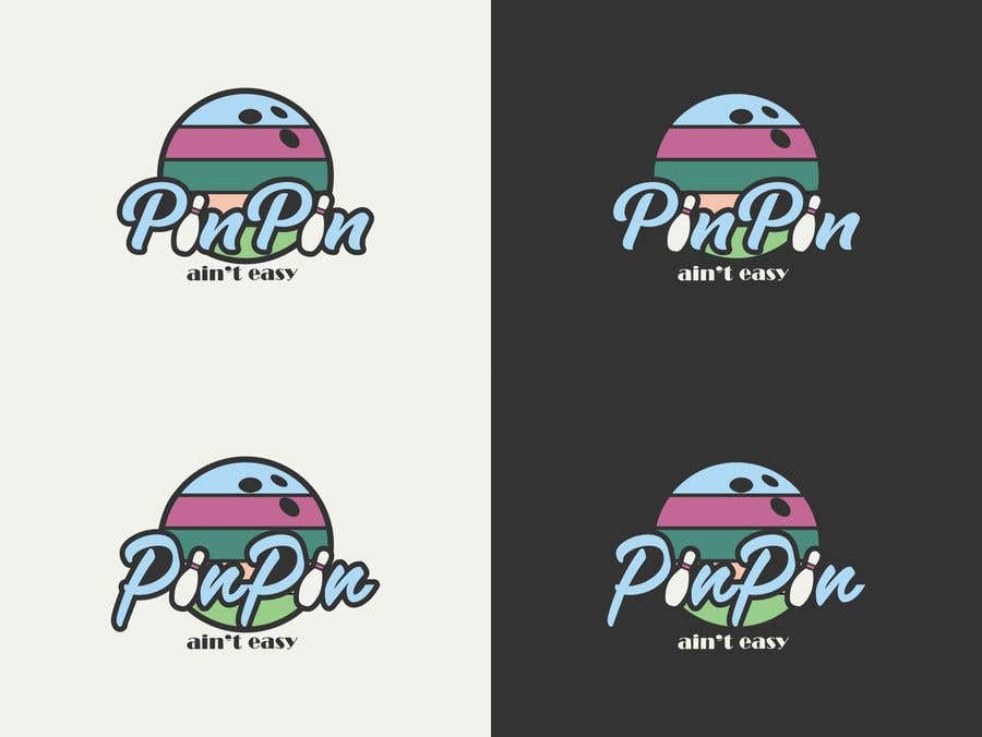
I'm sorry to keep you waiting. The upper design has a font from the image of Drive, and the lower one from the image of Miami. And I changed the holes on the ball as in the picture you posted. I noticed that there are designs that are the same as mine only with a different font, and that is not another design, it is a copy of my work.


