WINNER WILL HAVE EXTRA WORK AFTER - High Quality Label Packaging Design Required - Supplements
- Tila: Closed
- Palkinto: $590
- Vastaanotetut työt: 115
- Voittaja: dsgnlove

Kilpailun tehtävänanto
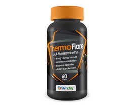
Ecommerce supplements store that specialises in weight loss/dieting, health and vitality. We would like the designer to work on a new line this time around called Mango Lean, this is African Mango 6000mg - please see attached mock design (not professiona
Suositellut taidot
Työnantajan palaute
“@dsgnlove won the contest on 5 February 2013”
![]() slimbay, United Kingdom.
slimbay, United Kingdom.
Julkinen selvennystaulu
-

dsgnlove
- 11 vuotta sitten
It's posted already.
- 11 vuotta sitten
-

Kilpailun järjestäjä - 11 vuotta sitten
Hi, sorry for the late reply. How do I post the winning design?
- 11 vuotta sitten
-

Drafix
- 11 vuotta sitten
Good designs dsgnlove and Lemur Catta, all the best for the future !!
- 11 vuotta sitten
-
LemurCatta
- 11 vuotta sitten
Dear slimbay,
we would be also really interested to see the winning design.
Thank you.
The LC Team- 11 vuotta sitten
-
Drafix
- 11 vuotta sitten
Once again Sir, I think we all have worked hard enough and deserve to see the winning design at least.I want to be sure that I have worked for a genuine contest.
- 11 vuotta sitten
-
Drafix
- 11 vuotta sitten
Yea...can we ??
- 11 vuotta sitten
-

vanillasky
- 11 vuotta sitten
can we see winning design ? thank you
- 11 vuotta sitten
-
dsgnlove
- 11 vuotta sitten
Thanks :)
- 11 vuotta sitten
-
LemurCatta
- 11 vuotta sitten
Dear slimbay,
please keep in mind that - as we are highly interested in a long-term cooperation - we can provide rearrangements of the details of our design according to your expectations.
Sincerely yours
The LC Team- 11 vuotta sitten
-
mariadesigns78
- 11 vuotta sitten
Hi, please check Private Message (click on my username "mariadesigns78"). Thanks.
- 11 vuotta sitten
-
LemurCatta
- 11 vuotta sitten
Dear slimbay,
We hope you are going to like one of our new, more colorful designs.
Sincerely yours
LC- 11 vuotta sitten
-

F5DesignStudio
- 11 vuotta sitten
any changes you want on #133 ?
- 11 vuotta sitten
-

Samadesign
- 11 vuotta sitten
Great Project, unfortunately i didn't saw it in the last days. I will check your profile for future projects.
Driss- 11 vuotta sitten
-
LemurCatta
- 11 vuotta sitten
Dear slimbay,
We are very happy to join your contest and we are awaiting your opinion.
In the case that you like #102 -105 please keep in mind that we can change and re-arrange the details according to your feedback and expectations.
Sincerely yours
The LC Team- 11 vuotta sitten
-
Kilpailun järjestäjä - 11 vuotta sitten
Hi,
I like the design a lot as it looks very professional. Although I have worries about the amount of colour used as all of the colour is beyond the cut marks on the template. I know that you have added mock ups of the designs on the bottles but for me a little more colour is required. Very professional designs though, great work.- 11 vuotta sitten
-
LemurCatta
- 11 vuotta sitten
Dear slimbay,
Thank you very much for the feedback.
The colors beyond the cut marks where just to visualize the idea - we were very careful not to use too much - as we understood from the earlier posts that you might be looking for something clean. We are working on new proposals to meet your requirements and we will present these within the next hours.
your Lemur-Catta-Team- 11 vuotta sitten
-

moncho37
- 11 vuotta sitten
Hi What you think about #96 #98 #99 ?
I will appreciate any feedback you have.- 11 vuotta sitten
Katso 2 viestiä lisää
-
moncho37
- 11 vuotta sitten
Thanks for your input I will work on a more cleaner look
Do you like to have a photo of the mango or you prefer something with out image?
Have a great day- 11 vuotta sitten
-
Kilpailun järjestäjä - 11 vuotta sitten
I will upload the photo a little later. I like the image but it doesn't have to dominate the design. Sometimes subtle is a good thing.
- 11 vuotta sitten
-
F5DesignStudio
- 11 vuotta sitten
any feedback on #95 and #97 please
- 11 vuotta sitten
-
Kilpailun järjestäjä - 11 vuotta sitten
Hi,
The design looks a lot better now that you have pulled this into a smaller space. I like how it looks on the bottle too. Unfortunately this is not in my top 3 at the moment though as I have had a lot of other great designs come in. I just want to be honest with you. I do like your work though.- 11 vuotta sitten
-
F5DesignStudio
- 11 vuotta sitten
Thanks. i`ll give another try today after work
- 11 vuotta sitten
-

wik2kassa
- 11 vuotta sitten
Hi slimbay, can you provide feedback on #66 ?
Thanks.- 11 vuotta sitten
-
wik2kassa
- 11 vuotta sitten
Thanks alot for the feedback. I got carried away with changes on #66 . I have uploaded a new design #101 I do hope you like it.
Thanks.- 11 vuotta sitten
-
Kilpailun järjestäjä - 11 vuotta sitten
Hi,
This one looks a lot cleaner, thank you. Having this on the bottle also really helps to visualize what the label will look like.- 11 vuotta sitten
-
PixelAngel
- 11 vuotta sitten
#112
- 11 vuotta sitten
-
Kilpailun järjestäjä - 11 vuotta sitten
please see comments above regarding #112
- 11 vuotta sitten
-
PixelAngel
- 11 vuotta sitten
provide feedback on #112 n #113 please. thank you
- 11 vuotta sitten
-
Kilpailun järjestäjä - 11 vuotta sitten
#112 is better than #113 but I still don't like the gradient on there. Maybe a fresh looking block colour might look a little more modern? The bullet points are very basic as well, perhaps ticks or an abstract design for each point might look a little nicer.
- 11 vuotta sitten
-
PixelAngel
- 11 vuotta sitten
need feedback for #114
- 11 vuotta sitten
-
Kilpailun järjestäjä - 11 vuotta sitten
Hi,
I am not sold on the gradient or the aggressive split between the orange/red and the white. The text looks difficult to read within the lighter parts of the gradient as well. Also, I do not like the way the 60x Capsules text has been presented, this is informational so should be a lot smaller.- 11 vuotta sitten
-
F5DesignStudio
- 11 vuotta sitten
#58 feedback please :)
- 11 vuotta sitten
-
Kilpailun järjestäjä - 11 vuotta sitten
Hi,
The design is very clean. I am not sure how this would look on the bottle though, is there any way that you could show this? The design section is very wide so it worries me that if it is sat upon a shelf there will be parts of the message or design that will wrap around the bottle and be lot from the customers vision.
Things that I would like to see as an improvement are:
A smaller design area so that the front facing part of the bottle will display all images and information.
Bullet points under the logo, I would rather the bullet points were aligned left and the text went the other way.
Font/Text is a little on the small side, this needs to be legible when the customer picks up the bottle as this is important information listed.
I cannot knock the design itself though as it is very clean and looks really good. How would this inherit across to my other products though as this is meant to be a uniform design that can be used across my entire product range.- 11 vuotta sitten
-
F5DesignStudio
- 11 vuotta sitten
expect my changes and new proposal soon, thank you!
- 11 vuotta sitten
-
Drafix
- 11 vuotta sitten
Hello Sir,
I have posted the updated designs as per your requirements. Hope you like it. Thank you !!- 11 vuotta sitten
-
Kilpailun järjestäjä - 11 vuotta sitten
Hi,
Now we are talking. These designs look a lot better than the last ones. Far clearer, easy to read and the design elements blend in with onne another a lot more than they did. Thank you very much.- 11 vuotta sitten
-
wik2kassa
- 11 vuotta sitten
Hi slimbay,
Thanks for rating my entry. Can you please provide private feedback so I can improve my design.
Thanks again.- 11 vuotta sitten
-
Kilpailun järjestäjä - 11 vuotta sitten
Hi,
I really like the design, it is very creative. I would like to see how this could be inherited across the rest of the product range though as I am not so sure the design will work so well as a uniform design. There are a points though:
No QR code included on the design.
Worried about the over hang on the orange graphic where the "60 capsules" text is.
The alignment on the left and right of the main design looks a mess.
Could do with a splash of colour in the heading Mango Lean, maybe have the "Lean" part in orange.
I would like to see what the design looks like without shadowing as this seems to eat into the text area.
Also, is there any way that you could display this label on a bottle as it is hard to visualize what it will look like on the packaging.
I really like the design though.- 11 vuotta sitten
-
wik2kassa
- 11 vuotta sitten
Thanks for taking the time to review. I will submit a revised design soon.
- 11 vuotta sitten
-
Drafix
- 11 vuotta sitten
Hello Sir, i would like get a feedback on entry no. 43, 44, 45 and 46 so that i can improvise on them. Thank you !!
- 11 vuotta sitten
-
Drafix
- 11 vuotta sitten
I agree with you. I'll work on it and post the updated ones as soon as possible. Thank You !!
- 11 vuotta sitten
-
Kilpailun järjestäjä - 11 vuotta sitten
Brilliant, thanks a lot.
- 11 vuotta sitten
-

noelopan1955
- 11 vuotta sitten
Hi! May I know what part of #21 & #29 needs improvement. Please PM me. Thanks so much.
- 11 vuotta sitten
-
Kilpailun järjestäjä - 11 vuotta sitten
Hi,
I am really sorry but I just do not like the design. Here is what I don't like:
The large capsules image
The border style design - it has an Indian type styling about it
The font is not very modern
No barcode or space for barcode
Position of the logo and the oval border around it
I am really sorry to say it but it just is a long way from what I am looking for. The only part of it I really like is the gradient on the background and the image of the mango (which was supplied with the brief). Please do not continue along the same line as this will not fit in very well with my brand. It needs to be a lot more modern, modern fonts etc etc.- 11 vuotta sitten
-

Enka
- 11 vuotta sitten
Hi!
What is the shape and dimensions of the container these labels will be put on? Like, bottle etc.
Sincerely,
Enka- 11 vuotta sitten
-
Kilpailun järjestäjä - 11 vuotta sitten
Hi, I require a design for the mango.lean label but it needs to be a uniform design I can use throughout my product range, this also means that the design will need to look good on box packaging as well.
- 11 vuotta sitten
-
Kilpailun järjestäjä - 11 vuotta sitten
Hi, these are labels and will be put on white bottles. check out www.slimbay.co.uk and look at the cutback XT slimming pills.
- 11 vuotta sitten
-

santarellid
- 11 vuotta sitten
please check #16 and #17 , thanks
- 11 vuotta sitten
-
Kilpailun järjestäjä - 11 vuotta sitten
thank you
- 11 vuotta sitten
Kuinka päästä alkuun kilpailuiden kanssa
-

Ilmoita kilpailusi Nopeaa ja helppoa
-

Vastaanota tonnikaupalla osallistumisia Ympäri maailmaa
-

Myönnä palkinto parhaalle työlle Lataa tiedostot - Helppoa!