Freelancer:
Cozmonator
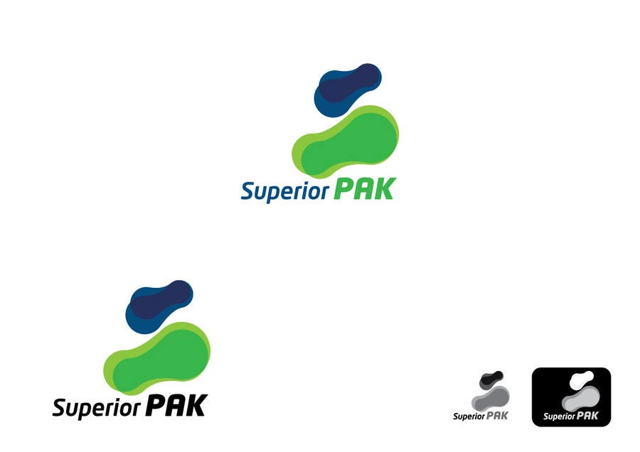
Superior PAK logo concept
Since it's a Modernisation of the logo. I have Applied an Abstract design to the concept the shapes are Moulds of S & P, going from small to large also implying growth. This applies to the compaction process. The colours are similar but now a more modern Palette has been applied (There is the option of applying the old black text colour to identify with the old logo).


