Freelancer: ixanhermogino
Jaa:
Tee ilmoitus työstä

UPDATE

I've tried to keep the hand colors in minimal design so I reduced and divide it into 3 parts which was being colored into blue black and red. I recreated the hands into illustrator because I wanted to give you a high quality or vectored logo.
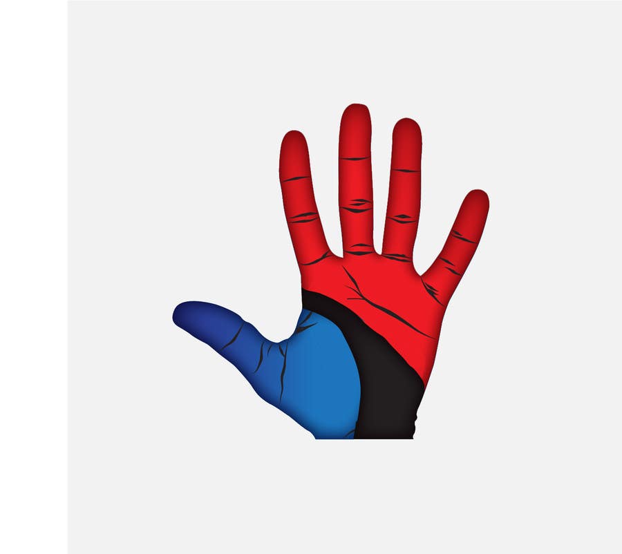
Kilpailutyö #17 kilpailussa                                                 Established Company Needs New Logo

Julkinen selvennystaulu

  • kensonfelizier
    Kilpailun järjestäjä
    • 10 vuotta sitten

    We've all been looking at your work here and are impressed.

    We are set to assign the winner on Saturday or Sunday. So far you are way ahead of every other contestant.

    Quick modification to this particular entry.
    First of all, the tone, shadow and simplicity are great.

    One quick change. We would like to compare this entry with one very similar.
    All you would have to do is extend the area of the black so that it also covers the index finger and the area of the palm beneath the palm line that is aligned with the palm.

    This should be our last edit.


    Thanks.

    K

    • 10 vuotta sitten